

Problem Statement
Confusing navigation and usability issues:making it hard for users to place orders efficiently.
Lack of trust in restaurant and delivery ratings:leading to hesitation in ordering.
Limited payment options:creating frustration for users with diverse financial preferences.
Home Page —— Store Info Page —— Check Out Page
Style Guide

DiDi FOOD
VISUAL EXPERIENCE UPGRADE
FLORENCE LAM

About Project
Didi Food is a user-friendly food delivery app that connects customers with a wide variety of restaurants and cuisines. With an intuitive interface, users can easily browse menus, place orders, and track deliveries in real-time.
Upgrading Page
We emphasizes user friendly navigation with intuitive icon and clear readable fonts. The colour pattern and the shape were selected from the brand LOGO.

Home page comparison


Color Icon Highlight – Visually emphasizes the delivery location.
Separated Search and Filter – Distinguishes search and filter functions for clarity.
Product Categorization – Organizes products into clear, intuitive categories.
Easier Navigation – Helps users quickly find what they’re looking for.

Top Background Frosted Glass Effect – Added when sliding, enhancing the page’s visual texture.
Redesigned Shopping Bag Interface – Boosts brand visibility while maintaining a seamless browsing experience.
Hidden by Default – Avoids obstruction of user navigation.
Automatic Reappearance – Shopping bag reappears 0.7 seconds after the user stops interacting with the page.
American-style Signage – Used as a design element when the store closes.
Visual Enhancement – Adds a distinctive, eye-catching feature to the interface.
Brand Endorsement Display – Appears as users slide to the bottom of the page
Brand Highlighting – Emphasizes the brand, reinforcing its presence and recognition

Store info page comparison

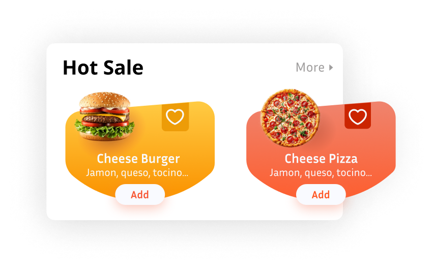
Hot-Selling Product Module – Positioned for easy access and visibility.
Visual Balance – Low placement on the left and high on the right to align with food images, ensuring an aesthetically balanced layout.
Store Closing Reminder – Notifies users when the store is about to close.

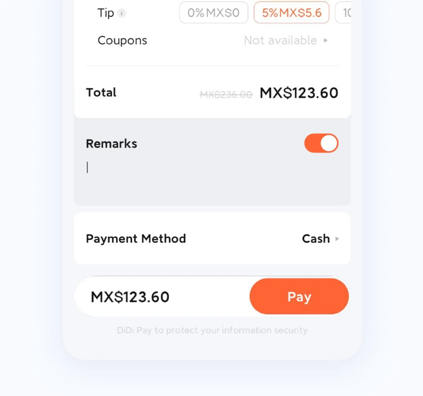
Check out page comparison

Reintegrate the top information to make the vision more focused and holistic
Enhanced Categories – Improved organization for easier navigation.
Stronger Guidance – Clearer user direction for a seamless experience.
Unified Operation Area – Ensures consistency and ease of use.
Optimized Add Form – Improved for a more intuitive interaction.
Takeout Box Design – Opens dynamically when a meal is selected.
Animated Effects – Enhances engagement and adds an emotional touch.
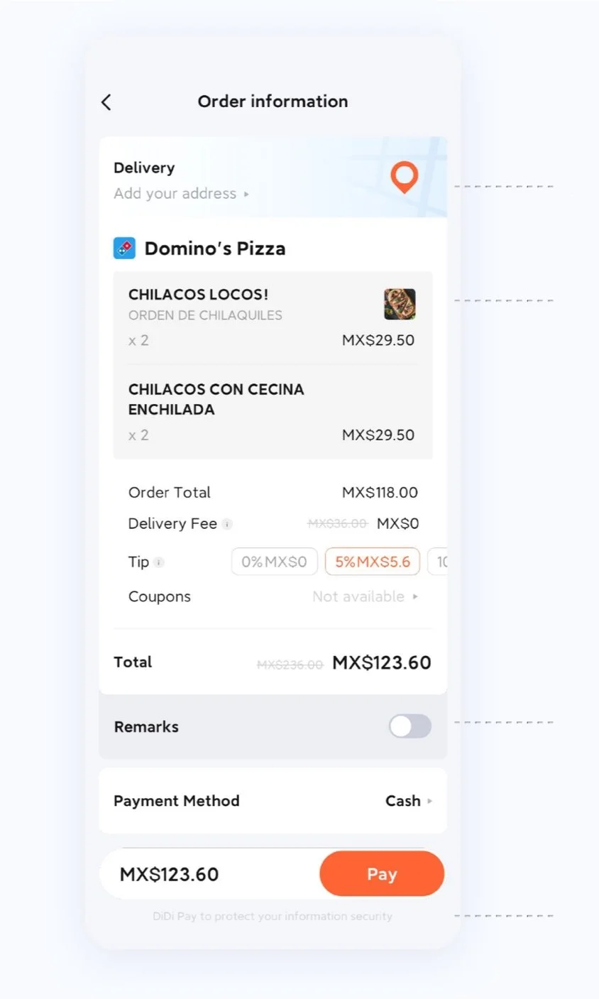

Food Scores Added – Users can select meals based on ratings.
Post-Order Evaluation – Users are prompted to rate their meal after completing the order, providing valuable feedback.
Enhanced Decision Making – Helps users make more informed choices based on others' experiences.
Map Icon Integration – Corresponding map icon enhances the location's visibility.
Removed Add/Subtract Buttons – Eliminated repetitive operations for a cleaner interface.
Simplified Interaction – Streamlined the user experience by reducing unnecessary steps.
Optimized Note Function – Keeps users focused without disrupting the experience.
Maintains Page Immersion – Reduces unnecessary page jumps, ensuring a smoother flow.
Payment Security Information – Displayed below the payment section for clear visibility.
Enhanced Brand Security – Reinforces trust by emphasizing secure payment processes
Remark Button – Added for users to leave additional notes or instructions.
Improved Communication – Allows users to provide specific details related to their order.
Enhanced User Experience – Offers a more personalized and flexible ordering process